Article Summary MTA separates two different jobs — reading market direction belongs to the higher timeframe; timing entries belongs to the lower timeframe. Mixing these two tasks in one chart is why technically clean setups fail. The higher timeframe sets a bias, not a signal — professionals use the daily or weekly chart to establish […]
Article Summary False breakouts are structural, not random — they happen because liquidity and stop-loss clusters concentrate at predictable levels, and larger players exploit that deliberately. The most dangerous fakeouts share a recognisable pattern — weak breakout candle, thin volume, no retest, and a choppy market behind it. Round numbers and obvious resistance are fakeout […]
Article Summary Liquidity is not about price direction — it measures how easily you can buy or sell an asset without the price moving against you in the process. The bid-ask spread is your fastest liquidity check — a tight spread means a liquid market; a wide spread means you are already paying a hidden […]
Article Summary The minimum and the realistic are very different numbers: brokers advertise what gets you in the door — experienced traders know you need considerably more to survive the learning curve. Forex has the lowest realistic starting point for active traders: a micro account with £500–£1,000 gives you room to manage risk properly without […]
Article Summary Most cluttered charts are not an information problem — they are a redundancy problem — adding more indicators from the same category gives you the same signal repeated, not independent confirmation. There are four indicator categories, and one from each is enough — trend, momentum, volatility, and volume each measure something different; stacking […]
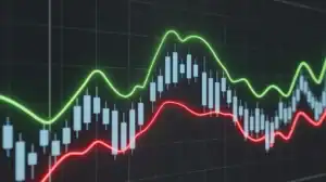
Article Summary Leading indicators signal before the move; lagging indicators confirm after it — but the more useful distinction is the job each type performs: anticipating reversals versus confirming trend direction. The market type should drive your indicator choice — leading indicators are most reliable in ranging, sideways markets; lagging indicators are better suited to […]
Article Summary The forex market never closes, but most of the opportunity does — around 70% of forex trading volume is concentrated in the London and New York sessions, leaving the rest of the day comparatively thin. The London–New York overlap is the single most active window — when both sessions run simultaneously (roughly 1pm–5pm […]
Article Summary Time horizon is the core difference: Trading targets short-term price movements — often hours or days. Investing is a long-term strategy measured in years or even decades. Traders use technical analysis. Investors rely on fundamental analysis — evaluating a company’s earnings, growth potential, and intrinsic value. Compounding is investing’s superpower. Reinvested dividends and […]
Article Summary The EMA reacts faster than the SMA because it gives more weight to recent prices — which makes it more useful for timing entries, not just identifying which direction to trade. The most reliable EMA entry method is the pullback, not the crossover: waiting for price to retrace to the EMA in an […]
Article Summary A moving average describes what price has done — it does not predict what price will do — understanding this distinction changes how you use moving averages and how much weight you give their signals. The SMA and EMA are not interchangeable — they suit different purposes — the EMA responds faster and […]